


NKNU BILINGUAL
面對全球化及國際化浪潮,臺灣以2030年為目標,成為雙語國家,國立高雄師範大學為臺灣指標性師資培育大學,更是南臺灣重要的教育領導機構,凸顯大學雙語化之重要性,透過前端陪育雙語教師,加以提升國家競爭力。
In the face of globalization and internationalization, Taiwan aims to become a bilingual country by 2030. National Kaohsiung Normal University, as a leading institution in teacher education and a significant educational hub in southern Taiwan, highlights the importance of bilingualization in universities. By nurturing bilingual teachers at the forefront, it enhances the nation's competitiveness.
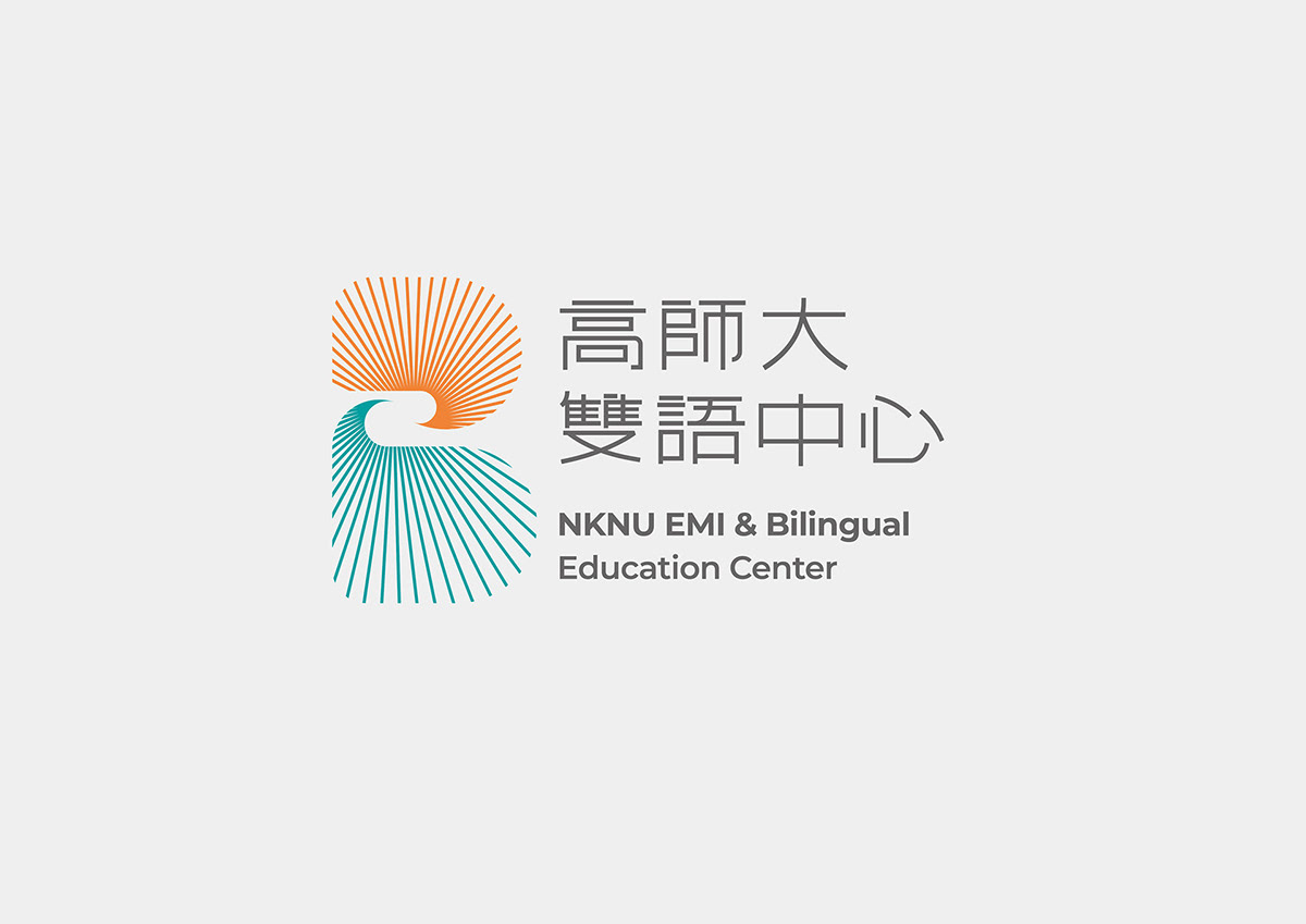
色彩形象規劃為高師代表色橙色及藍色搭配,橙色象徵南方熱情的陽光,水藍則象徵高雄這座海洋城市,透過海洋向世界交流。
The color scheme is planned with orange and blue as representative colors for National Kaohsiung Normal University. Orange symbolizes the warmth of the southern sunlight, while aqua blue represents Kaohsiung as a maritime city, fostering global exchange through the ocean.


LOGO設計以三個「B」元素組成,分別為 Bilingual、 Bilateral Dialogue、 Brightness ,以Bilingual 的自首「B」作為圖形框架,融合雙向之對話筐相互交流,透過象徵智慧的光芒向外散播,讓智慧突破語言的界線與世界接軌。
The logo design consists of three elements: Bilingual, Bilateral Dialogue, and Brightness. Using the initial "B" from Bilingual as the graphical framework, it integrates bilateral dialogue baskets for mutual exchange. Through the symbol of the radiant light representing wisdom, it transcends language barriers and connects with the world, allowing intelligence to bridge the gap.


